Viral Nation, social media app for creators
A creator-first social app where short video, community and brand collabs sit in one calm space.
Viral Nation is a creator-led social platform. The brief was to design a mobile app that gave creators a calmer home than the platforms they were already on, with short video at the centre, community spaces for fans, and a clear way to manage brand collaborations. The work covered research, IA, flows, a small design system and a high-fidelity prototype handed to engineering.
Creators were juggling three or four apps to post, talk to their community and manage brand deals. Everything felt noisy and nothing helped them see how a piece of content was actually doing.
Design a single mobile app that pulled feed, creation, community and brand collabs into one space, without copying the visual chaos of the platforms creators were trying to escape.
Senior Product Designer leading research, IA, flows, UI and the prototype. I worked with one PM, one engineering lead and the founder.
A tested high-fidelity prototype, a small reusable component library and a prioritised backlog. The team took it into build with a clear point of view on what to ship first and what to defer.
Creators wanted one calm place, not another loud feed.
I spoke to twelve creators across short video, lifestyle and gaming. The same pattern came back every time: they posted on one app, replied to their community on another, and tracked brand collabs in spreadsheets and DMs.
Nobody asked for more features. They asked for fewer tabs, less noise and a clearer sense of how a post was actually landing with the people who cared about it.
Twelve interviews, two diary studies, a lot of screenshots.
I ran twelve remote interviews and two short diary studies. Creators sent me screenshots of their week, what they posted, where the conversation happened and which DMs they wished they had answered.
Three jobs to be done came out of it: post short video without friction, keep a real conversation going with the people who already follow, and manage brand collabs without losing track of money or deadlines.
- ·Twelve semi-structured interviews, sixty minutes each
- ·Two seven-day diary studies with daily prompts
- ·Affinity mapping across roughly two hundred quotes
- ·Three primary personas: the short-video creator, the community builder, the part-time creator with a day job
Four tabs, not seven.
Early concepts had seven tabs because every stakeholder wanted their feature on the bottom bar. Testing killed that quickly. People could not remember what lived where.
I cut it to four: Feed, Discover, Create and You. Brand collabs live inside You as a clear, separate space, so creators do not see deal admin every time they open the app.
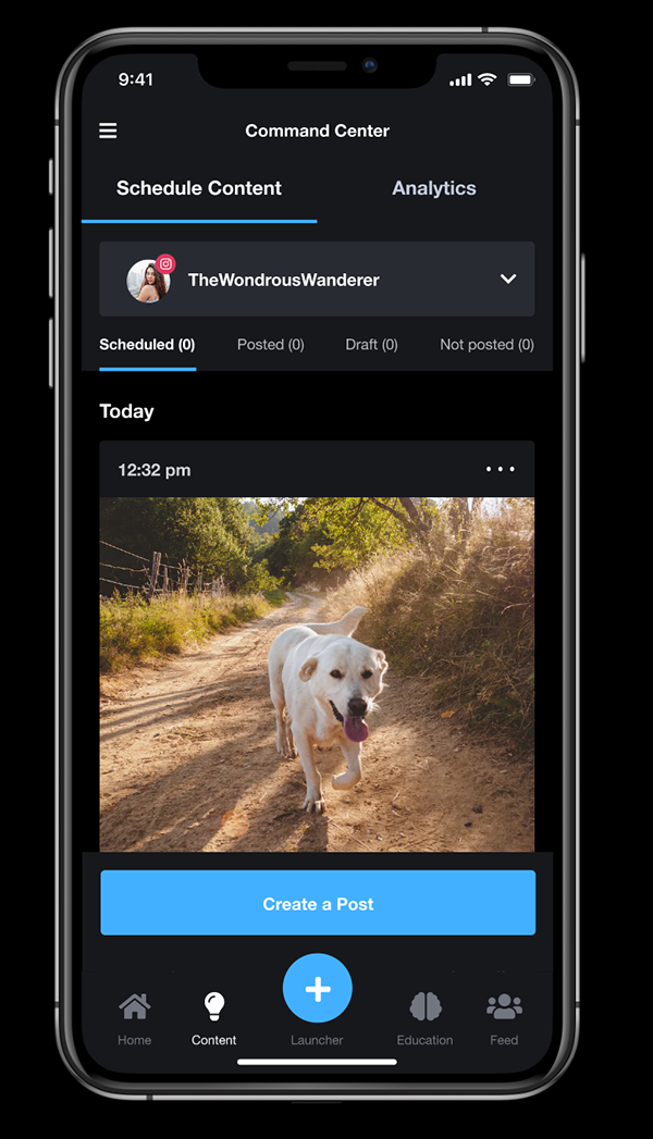
Quiet by default, loud when it matters.
The feed uses a single column with generous spacing. Reactions and comments sit under the post rather than floating over the video, so the content stays readable while scrolling.
Interaction-wise, I wanted the app to feel one-handed. The primary thumb zone covers like, comment and the post-in-focus action sheet. Double tap likes, long press opens the quiet action sheet, swipe up on a post opens its community room. Haptics fire only on commit moments, never on scroll, so the device never feels chatty.
I tested two versions: one with autoplay everywhere, one with autoplay only on the post in focus. The focused version won on every measure, time on post, recall and comfort.
- ·Single-column feed with clear post boundaries
- ·Autoplay only on the post in focus, sound off by default
- ·Reactions grouped, not stacked, to reduce visual noise
- ·Double tap to react, long press for the action sheet, swipe up to enter the community room
- ·Haptic feedback on commit actions only, never on scroll
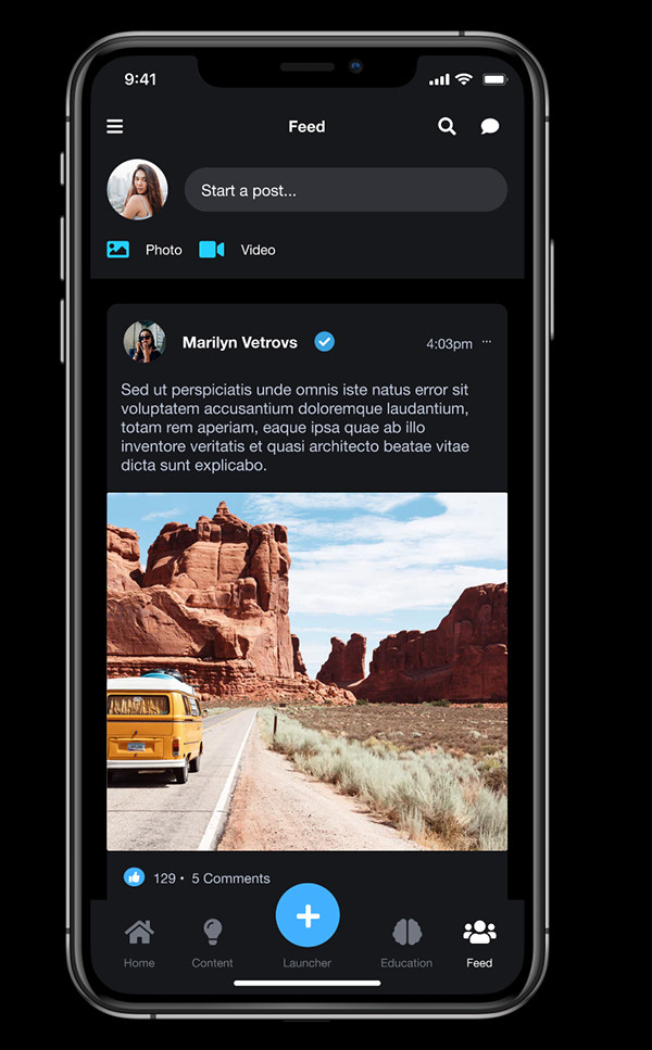
From idea to posted in under a minute.
The old flow took eleven taps from the home screen to a posted video. I rebuilt it around three steps: record or pick, trim and caption, post. Filters, covers and scheduling sit behind a single "more" panel for the people who want them.
In testing, the new flow took a median of forty-two seconds for a first post and twenty-eight seconds for a return post.
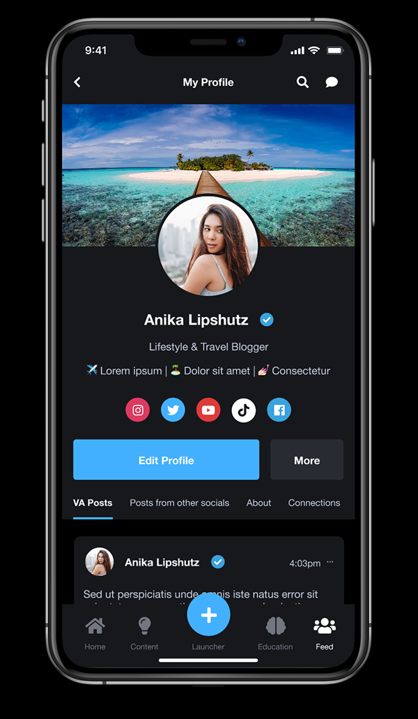
A real conversation, not another comment thread.
Creators kept saying their best conversations happened in DMs, not under posts. I designed small persistent community rooms attached to a creator profile, with light moderation tools and pinned questions.
Rooms have a clear quiet mode that mutes notifications but keeps the thread, so creators can drop in without feeling on call.
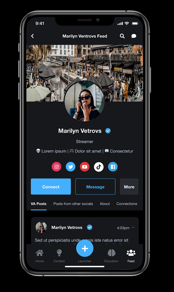
Treating deal admin like a first-class flow.
Brand work is how most of the creators I spoke to actually paid rent, but every app I looked at hid it inside a settings screen. I gave it a proper home inside the You tab, with three clear states: pitched, in progress, paid.
Each deal has a single page with the brief, the deadline, the deliverables and the payment status. No spreadsheets, no screenshotting DMs.
- ·Three-state pipeline: pitched, in progress, paid
- ·Deal page with brief, deliverables, deadline and payment status
- ·Reminders one week and one day before a deadline
- ·Quick export of a deal summary for tax and accounting
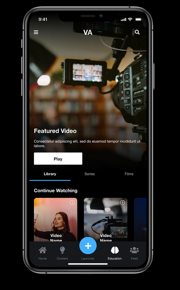
Warm, confident, not another dark social skin.
The visual direction is warm coral on cream, with one accent and generous whitespace. It was a deliberate move away from the high-contrast, neon-on-black look that creators told me felt aggressive after a long day of posting.
I built a small reusable library: type ramp, spacing scale, colour tokens and twelve components covering buttons, post cards, sheets, tabs and inputs. Engineering picked it up without redrawing anything.
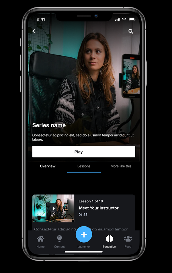
Side by side with what creators were already using.
I prototyped two screens, feed and profile, in the style of the apps creators were juggling and tested them next to the Viral Nation version. The point was not to win a beauty contest, it was to check that the calmer treatment did not feel underpowered.
Eight out of eight participants picked the Viral Nation version for daily use. Two said the noisier version felt more exciting for five seconds and exhausting after a minute.
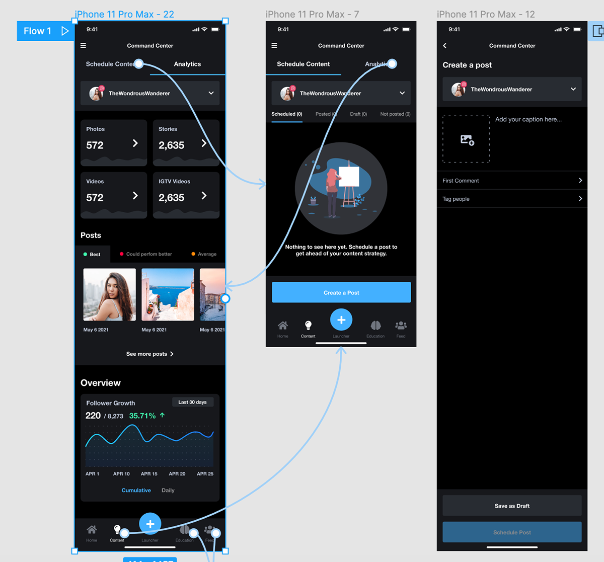
The round that nearly broke the design, and what I did with it.
Round one went badly in a way I had not seen coming. Five of eight participants could not find Create. The icon I had chosen read as a search button in context, and two creators tried to film a video by tapping their own avatar. The Create tab had a 38 per cent task-completion rate. I felt sick watching the third session in a row fail the same way.
Instead of patching the icon and moving on, I stopped testing for a day and re-ran a tiny tree test with six new people on the navigation alone. That gave me a real answer: the issue was not the icon, it was the label and the position. I moved Create to the centre of the tab bar with a labelled pill, redrew the icon, and added a one-time coach mark on first launch.
Round two used the same eight tasks with eight fresh participants. Every task was completed without help. Create went from 38 per cent to 100 per cent completion. The bigger lesson was about staying honest in the room: I stopped defending the design and started writing down what people actually did.
- ·Round one, eight participants, four core tasks, Create tab completion 38 per cent
- ·Diagnosed the failure with a focused six-person tree test before redesigning
- ·Round two, eight participants, same tasks, 100 per cent completion without help
- ·System Usability Scale moved from 64 to 84 between rounds
- ·Strongest qualitative theme in round two: "it feels like one app, not five"
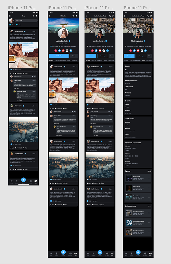
Turning "we cannot build that" into "here is how we will".
Two weeks into build the engineering lead came back with a list of things that would not work as drawn. Autoplay-on-focus needed a scroll observer the team had not written before. The action sheet animation I had specified was going to cost frames on older Android devices. Community rooms were going to need a websocket layer that was not in the sprint.
I did not push back on the constraints, I sat with two engineers for an afternoon and we re-cut each pattern into a version they could ship now and a version we could grow into. Autoplay-on-focus became autoplay on the centre card only, using a simpler intersection threshold. The action sheet kept its layout but lost the spring and gained a flat 180ms ease. Community rooms shipped as polled threads for v1, with the socket layer scheduled for v1.1.
I rebuilt the affected screens in Figma the same week and re-annotated the prototype so QA had one source of truth. Nothing in the user experience that mattered was lost, and the team stopped feeling like design was throwing work over a wall.
- ·Joint design and engineering review of every pattern flagged as expensive
- ·Each pattern re-cut into a v1 "ship now" version and a v1.1 "grow into" version
- ·Figma updated the same week so QA, design and engineering shared one source of truth
- ·Weekly thirty-minute design and engineering sync booked for the rest of the build
What the team took into build.
The work shipped to engineering as a prototype, a component library and a prioritised backlog. The team had a clear point of view on what to ship in the first release and what to hold.
- ·Phase one scope: feed, create, community rooms and brand collab pipeline
- ·Phase two backlog: scheduling, analytics, paid subscriptions for fans
- ·A small design system that engineering could build against without redrawing
- ·A research summary the founder used to brief investors and new hires
Less product, more confidence.
The instinct in social apps is to add. Another tab, another reaction, another badge. The work that paid off here was the opposite. Cutting tabs, grouping reactions, hiding admin until it was needed.
I also learnt to treat brand collabs as a real flow, not a settings page. It changed how creators talked about the app in testing.
What I would do in a phase two.
If I picked this up again I would invest in analytics for creators, scheduling and a lightweight paid subscriptions feature for fans. All three came up repeatedly in interviews but did not make the first release.
- ·Creator analytics focused on reach quality, not raw views
- ·Native scheduling so creators stop using a second tool
- ·Fan subscriptions with a clear, honest split shown up front
- ·Accessibility pass on motion and captions for autoplay video
Built to be picked up, not just admired.
Handover ran over two structured sessions and a written pack, not a single meeting. The first session was two hours with engineering and QA, walking the prototype flow by flow with the backlog open beside it. The second was an hour with the founder and PM on what shipped in v1, what waited for v1.1, and why.
Every Figma frame was annotated against a user story and a research finding, so anyone could trace a button back to why it existed. Components were named to match the codebase the engineers were already using, with auto-layout, variants and states pre-built so QA had no ambiguity to argue about. I left a one-page "if you only read this" summary at the top of the file for whoever picked it up six months later.
After handover I stayed available for a thirty-minute weekly office hour for the first month of build, so questions got answered in the file instead of in a Slack thread that nobody could find later.
- ·Two-hour walkthrough with engineering and QA, then a one-hour session with the founder and PM
- ·Annotated Figma file: every frame linked to a user story and the research finding behind it
- ·Components named to match the codebase, with variants and states pre-built for QA
- ·Prototype links per flow mapped to v1 and v1.1 scope
- ·One-page "if you only read this" summary at the top of the file
- ·Weekly thirty-minute design office hour for the first month of build
Screens, prototypes and design artefacts.
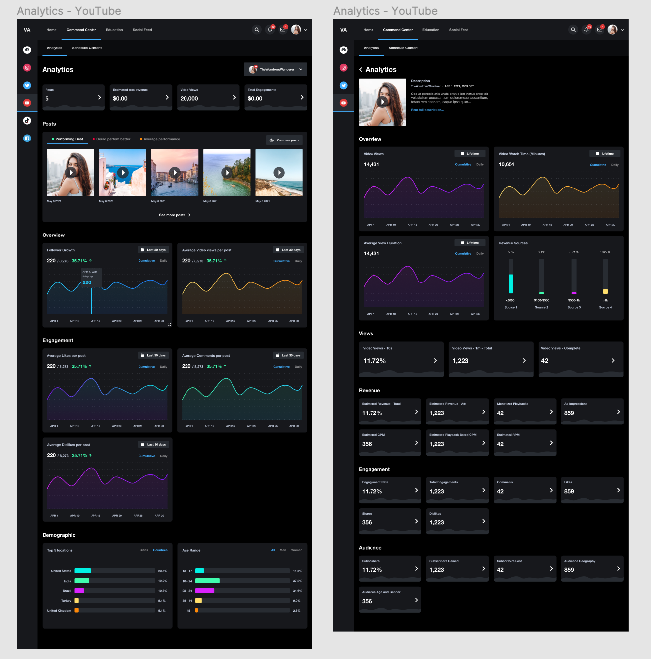
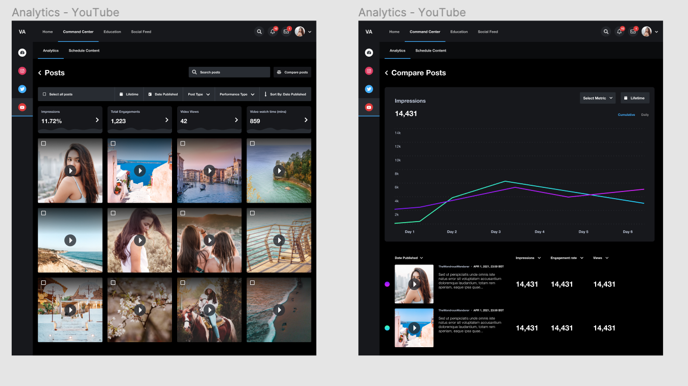
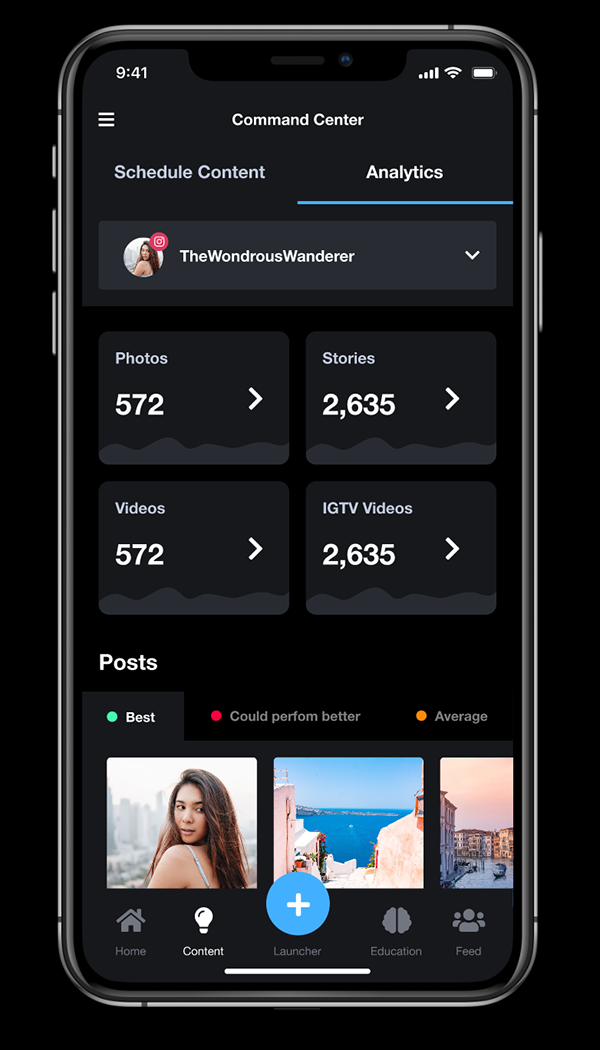
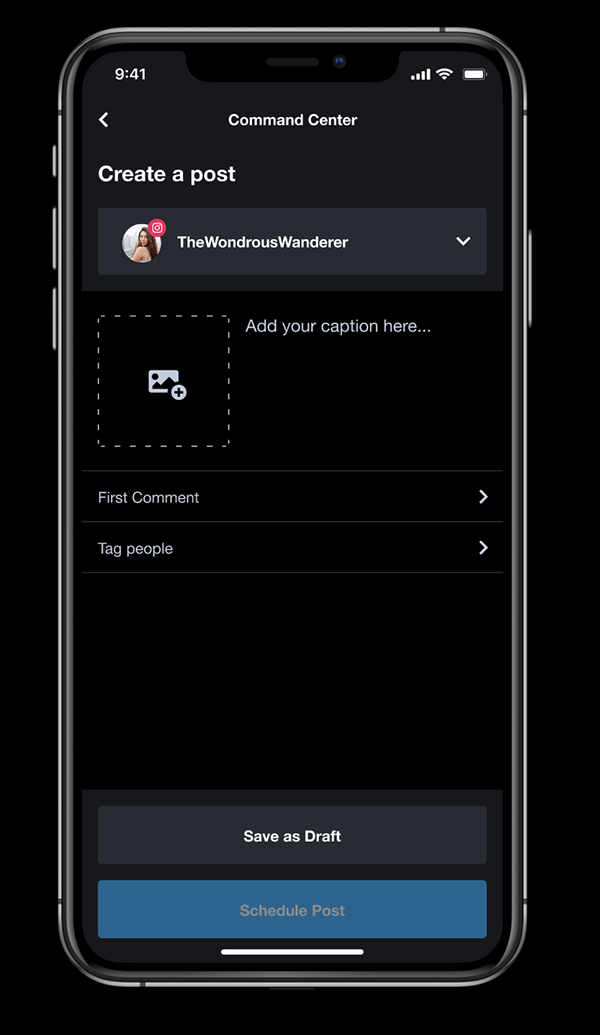
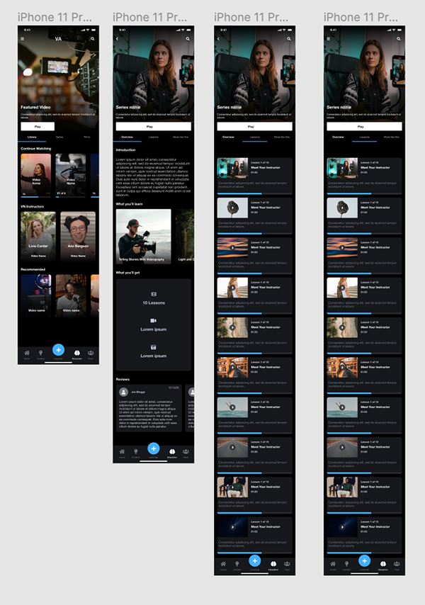
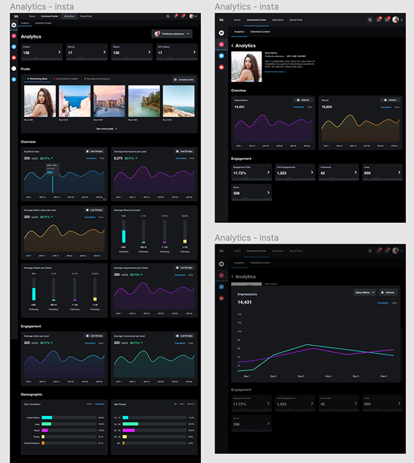
These images were uploaded with the original case studies. They show the prototype screens, research artefacts, design system work and visual decisions behind the written story.